Vanilla JS Mobile Data Tables
Personal Project
- Last Touched: August 2022
- Client: Personal Project
- Bundler: Webpack
- CSS Framework: Bootstrap
- CSS Preprocessor: LESS
- Link: Github Repo
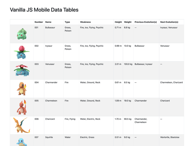
This is some vanilla JS that I wrote to make data heavy tables look and function better on mobile. I need this functionality for a project but couldn’t find an existing version of it that didn’t require JQuery, so I rewrote it in JS and added some personal touches.
Functionality:
- Allows the table to scroll horizontally when the table width is larger than the container width on screen sizes larger than 767px
- On screen sizes smaller than 768px it stacks the cell, inserts the copy from the corresponding
<th>in each cell to the left of the contents as a<span>, and hides the<thead> - If the class
.no-mobileis added to a<th>then that column header does not get added to the cells of that column on mobile